I was to draw an outdoor scene of my choice finding a view that included some natural objects trees, shrubs, pot plants, garden plants. I had to show my understanding of arial or linear perspective showing depth. It also had to offer the opportunity to draw straight lined objects as well as items drawn from nature: buildings walls, fences gates and so on.
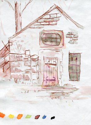
I was to set myself plenty of time. Do preliminary drawing in my sketchbook to experiment, try various medias, and use an A1-A2 sheet of paper . Spend anything up to 2 hours drawing this. Well I think I did everything else but the drawing took 6 hours. 3 hours to prime the paper with the cream background and the line drawing. Then 3hrs to apply the layers, which I had to spray and dry before working over them.
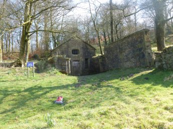
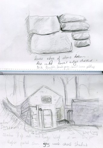
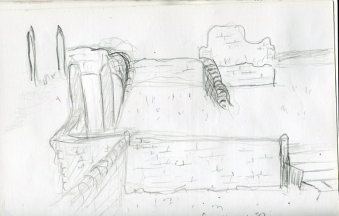
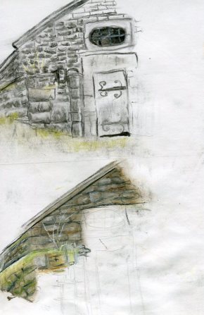
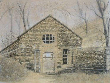
I began by spending a lot of time wandering around the area of Hollinshead Hall where there are ruins, the only building that had been rebuilt was the Holy Well House. I decided in the end to concentrate on the well and spent ages trying to decide on the best angle to draw the building that would fulfill the criteria of the assignment. I took a photograph of the wider area and a couple of sketches. I also did one of the ruins and stonework, it was the sketch of the ruins that made me decide they would not work. I then did various sketches to decide which media to use. I decided the limited pallet charcoal and pastel worked best, none of the others gave the atmosphere I was looking for. I love the old masters drawings, I find this one by Peter Paul Rubens amazing giving the sense of age and atmosphere, I wanted for my drawing. I have looked at it many times over the last year for inspiration.http://www.peterpaulrubens.net/the-battle-of-anghiari.jsp
One thing that occurred to me whist trying out the various media, is that, after doing the drawing a couple of times, I didn’t feel the need to refer to other sketches or the photograph much. I was relying from memory and my work was being made with a freedom I haven’t had before, steering me away from a more intense photo realistic style, and I like it. I feel this could be built on by doing a few more preliminary sketches in the field in future, as I feel the time spent analyzing my subject, instead of copying it, is what is giving me this freedom.
The photograph does nothing to show how eerie this area feels whilst you are there. It is said to be haunted and I must admit I can understand why. I wanted to portray this feeling and decided to try a misty affect in the background. I had to work this several times in layers. I did the first layer added trees, then reworked it 3 times to give it the misty look, the trees lay faint between the applications. I didnt want a block colour I wanted the background to show through to add to the depth. The background was achieved by placing a layer of chalk pastel on paper, I then sprayed with water and rubbed the pigment into the paper. As it was drying I wiped a lot of the pastel off with kitchen roll. That gave a slightly rough but fainter colour, not quite as faint as I wanted, I think I would have liked it lighter as with the sketch I did, but I stupidly didn’t try it out on the watercolour paper before I started the picture.
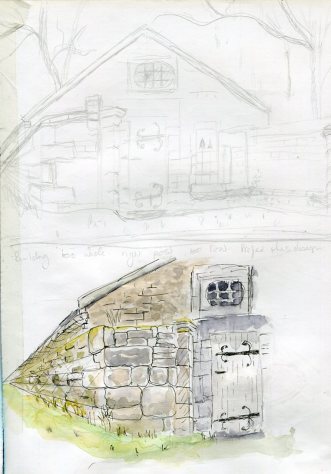
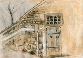
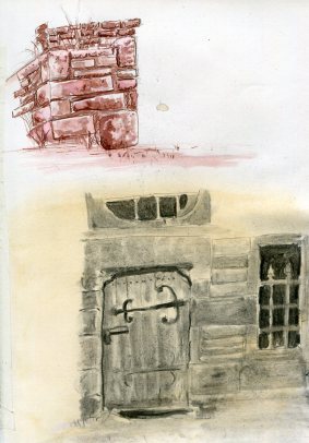
I used charcoal for the building and white chalk for the highlights and door. Various techniques were adopted for the stonework and lifting and smudging helped with the tone and texture.
My favourite part which I think worked well is the shelf running around the right side, I am not sure what this is, but it looks like it could have been a seat, maybe where people would queue for the Holy Water. I lifted lighter areas to portray the ledge and the leaves of wild plants growing in the damp. It worked as it gave a suggestion of form, giving the eye interest. I didnt like the chalk highlighted areas as much as I thought I would and if I was to do the drawing again would probably restrict this to the door and the misty affect to the rear which worked well because it portrayed the eerie cold atmosphere I wanted. It also worked well in giving depth to the picture, lessening the tone of the receding tree line and lightening the background.